shoot 8 editing process


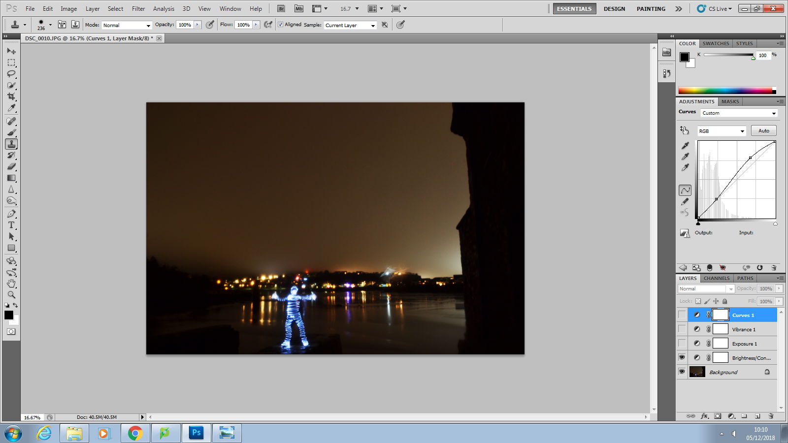
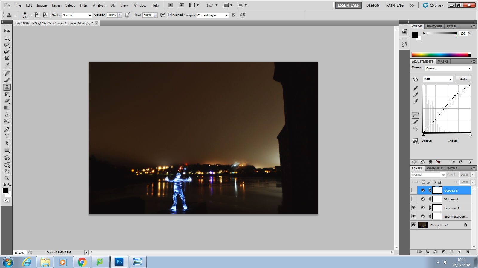
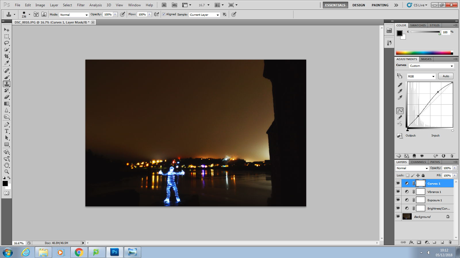
From the first picture to the second I changed the brightness of the image. By doing this it made the figure look more full and pop a bit more out of the photo. This also made the background lights and the sky have a more orange tint. The sky has a more orange tint due to the light pollution from the houses. I adjusted the exposure, offset and gamma correction which made the image darker down a little bit which once again made the man stand out in the image more. After adding this layer it made the sky go back to a more monochrome colour so I changed the vibrance and saturation. This gave the sky a orange tint again which I feel works really well due to all the other picture being in black and white and then this one being coloured. To finish this photo up I adjusted the curves which makes the background lights lighten up. I also like how there is a light coming from behind the building on the right hand side. I feel this gives the photo a very strong composition.
